 Iris 1.10
Iris 1.10
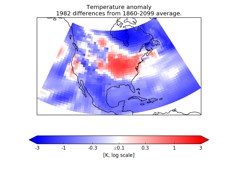
In this example, we need to plot anomaly data where the values have a “logarithmic” significance – i.e. we want to give approximately equal ranges of colour between data values of, say, 1 and 10 as between 10 and 100.
As the data range also contains zero, that obviously does not suit a simple logarithmic interpretation. However, values of less than a certain absolute magnitude may be considered “not significant”, so we put these into a separate “zero band” which is plotted in white.
To do this, we create a custom value mapping function (normalization) using the matplotlib Norm class matplotlib.colours.SymLogNorm. We use this to make a cell-filled pseudocolour plot with a colorbar.
NOTE: By “pseudocolour”, we mean that each data point is drawn as a “cell” region on the plot, coloured according to its data value. This is provided in Iris by the functions iris.plot.pcolor() and iris.plot.pcolormesh(), which call the underlying matplotlib functions of the same names (i.e. matplotlib.pyplot.pcolor and matplotlib.pyplot.pcolormesh). See also: http://en.wikipedia.org/wiki/False_color#Pseudocolor.
"""
Colouring anomaly data with logarithmic scaling
===============================================

In this example, we need to plot anomaly data where the values have a
"logarithmic" significance  -- i.e. we want to give approximately equal ranges
of colour between data values of, say, 1 and 10 as between 10 and 100.

As the data range also contains zero, that obviously does not suit a simple
logarithmic interpretation.  However, values of less than a certain absolute
magnitude may be considered "not significant", so we put these into a separate
"zero band" which is plotted in white.

To do this, we create a custom value mapping function (normalization) using
the matplotlib Norm class `matplotlib.colours.SymLogNorm
<http://matplotlib.org/api/colors_api.html#matplotlib.colors.SymLogNorm>`_.
We use this to make a cell-filled pseudocolour plot with a colorbar.

NOTE: By "pseudocolour", we mean that each data point is drawn as a "cell"
region on the plot, coloured according to its data value.
This is provided in Iris by the functions :meth:`iris.plot.pcolor` and
:meth:`iris.plot.pcolormesh`, which call the underlying matplotlib
functions of the same names (i.e. `matplotlib.pyplot.pcolor
<http://matplotlib.org/api/pyplot_api.html#matplotlib.pyplot.pcolor>`_
and  `matplotlib.pyplot.pcolormesh
<http://matplotlib.org/api/pyplot_api.html#matplotlib.pyplot.pcolormesh>`_).
See also: http://en.wikipedia.org/wiki/False_color#Pseudocolor.

"""
import cartopy.crs as ccrs
import iris
import iris.coord_categorisation
import iris.plot as iplt
import matplotlib.pyplot as plt
import matplotlib.colors as mcols


def main():
    # Enable a future option, to ensure that the netcdf load works the same way
    # as in future Iris versions.
    iris.FUTURE.netcdf_promote = True

    # Load a sample air temperatures sequence.
    file_path = iris.sample_data_path('E1_north_america.nc')
    temperatures = iris.load_cube(file_path)

    # Create a year-number coordinate from the time information.
    iris.coord_categorisation.add_year(temperatures, 'time')

    # Create a sample anomaly field for one chosen year, by extracting that
    # year and subtracting the time mean.
    sample_year = 1982
    year_temperature = temperatures.extract(iris.Constraint(year=sample_year))
    time_mean = temperatures.collapsed('time', iris.analysis.MEAN)
    anomaly = year_temperature - time_mean

    # Construct a plot title string explaining which years are involved.
    years = temperatures.coord('year').points
    plot_title = 'Temperature anomaly'
    plot_title += '\n{} differences from {}-{} average.'.format(
        sample_year, years[0], years[-1])

    # Define scaling levels for the logarithmic colouring.
    minimum_log_level = 0.1
    maximum_scale_level = 3.0

    # Use a standard colour map which varies blue-white-red.
    # For suitable options, see the 'Diverging colormaps' section in:
    # http://matplotlib.org/examples/color/colormaps_reference.html
    anom_cmap = 'bwr'

    # Create a 'logarithmic' data normalization.
    anom_norm = mcols.SymLogNorm(linthresh=minimum_log_level,
                                 linscale=0,
                                 vmin=-maximum_scale_level,
                                 vmax=maximum_scale_level)
    # Setting "linthresh=minimum_log_level" makes its non-logarithmic
    # data range equal to our 'zero band'.
    # Setting "linscale=0" maps the whole zero band to the middle colour value
    # (i.e. 0.5), which is the neutral point of a "diverging" style colormap.

    # Create an Axes, specifying the map projection.
    plt.axes(projection=ccrs.LambertConformal())

    # Make a pseudocolour plot using this colour scheme.
    mesh = iplt.pcolormesh(anomaly, cmap=anom_cmap, norm=anom_norm)

    # Add a colourbar, with extensions to show handling of out-of-range values.
    bar = plt.colorbar(mesh, orientation='horizontal', extend='both')

    # Set some suitable fixed "logarithmic" colourbar tick positions.
    tick_levels = [-3, -1, -0.3, 0.0, 0.3, 1, 3]
    bar.set_ticks(tick_levels)

    # Modify the tick labels so that the centre one shows "+/-<minumum-level>".
    tick_levels[3] = r'$\pm${:g}'.format(minimum_log_level)
    bar.set_ticklabels(tick_levels)

    # Label the colourbar to show the units.
    bar.set_label('[{}, log scale]'.format(anomaly.units))

    # Add coastlines and a title.
    plt.gca().coastlines()
    plt.title(plot_title)

    # Display the result.
    iplt.show()


if __name__ == '__main__':
    main()
(Source code, png)
