 Iris 1.9
Iris 1.9
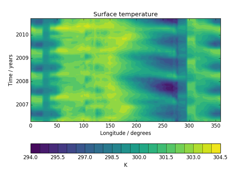
This example demonstrates the creation of a Hovmoller diagram with fine control over plot ticks and labels. The data comes from the Met Office OSTIA project and has been pre-processed to calculate the monthly mean sea surface temperature.
"""
Hovmoller diagram of monthly surface temperature
================================================

This example demonstrates the creation of a Hovmoller diagram with fine control over plot ticks and labels.
The data comes from the Met Office OSTIA project and has been pre-processed to calculate the monthly mean sea
surface temperature.

"""
import matplotlib.pyplot as plt
import matplotlib.dates as mdates

import iris
import iris.plot as iplt
import iris.quickplot as qplt
import iris.unit


def main():
    fname = iris.sample_data_path('ostia_monthly.nc')

    # load a single cube of surface temperature between +/- 5 latitude
    cube = iris.load_cube(fname, iris.Constraint('surface_temperature', latitude=lambda v: -5 < v < 5))

    # Take the mean over latitude
    cube = cube.collapsed('latitude', iris.analysis.MEAN)

    # Now that we have our data in a nice way, lets create the plot
    # contour with 20 levels
    qplt.contourf(cube, 20)

    # Put a custom label on the y axis
    plt.ylabel('Time / years')

    # Stop matplotlib providing clever axes range padding
    plt.axis('tight')

    # As we are plotting annual variability, put years as the y ticks
    plt.gca().yaxis.set_major_locator(mdates.YearLocator())

    # And format the ticks to just show the year
    plt.gca().yaxis.set_major_formatter(mdates.DateFormatter('%Y'))

    iplt.show()


if __name__ == '__main__':
    main()
(Source code, png)