 Iris 1.10
Iris 1.10
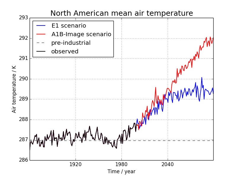
Produces a time-series plot of North American temperature forecasts for 2 different emission scenarios. Constraining data to a limited spatial area also features in this example.
The data used comes from the HadGEM2-AO model simulations for the A1B and E1 scenarios, both of which were derived using the IMAGE Integrated Assessment Model (Johns et al. 2010; Lowe et al. 2009).
Johns T.C., et al. (2010) Climate change under aggressive mitigation: The ENSEMBLES multi-model experiment. Climate Dynamics (submitted)
Lowe J.A., C.D. Hewitt, D.P. Van Vuuren, T.C. Johns, E. Stehfest, J-F. Royer, and P. van der Linden, 2009. New Study For Climate Modeling, Analyses, and Scenarios. Eos Trans. AGU, Vol 90, No. 21.
See also
Further details on the aggregation functionality being used in this example can be found in Cube statistics.
"""
Global average annual temperature plot
======================================

Produces a time-series plot of North American temperature forecasts for 2
different emission scenarios. Constraining data to a limited spatial area also
features in this example.

The data used comes from the HadGEM2-AO model simulations for the A1B and E1
scenarios, both of which were derived using the IMAGE Integrated Assessment
Model (Johns et al. 2010; Lowe et al. 2009).

References
----------

   Johns T.C., et al. (2010) Climate change under aggressive mitigation: The
   ENSEMBLES multi-model experiment. Climate Dynamics (submitted)

   Lowe J.A., C.D. Hewitt, D.P. Van Vuuren, T.C. Johns, E. Stehfest, J-F.
   Royer, and P. van der Linden, 2009. New Study For Climate Modeling,
   Analyses, and Scenarios. Eos Trans. AGU, Vol 90, No. 21.

.. seealso::

    Further details on the aggregation functionality being used in this example
    can be found in :ref:`cube-statistics`.

"""
import numpy as np
import matplotlib.pyplot as plt
import iris
import iris.plot as iplt
import iris.quickplot as qplt

import iris.analysis.cartography


def main():
    # Enable a future option, to ensure that the netcdf load works the same way
    # as in future Iris versions.
    iris.FUTURE.netcdf_promote = True

    # Load data into three Cubes, one for each set of NetCDF files.
    e1 = iris.load_cube(iris.sample_data_path('E1_north_america.nc'))

    a1b = iris.load_cube(iris.sample_data_path('A1B_north_america.nc'))

    # load in the global pre-industrial mean temperature, and limit the domain
    # to the same North American region that e1 and a1b are at.
    north_america = iris.Constraint(longitude=lambda v: 225 <= v <= 315,
                                    latitude=lambda v: 15 <= v <= 60)
    pre_industrial = iris.load_cube(iris.sample_data_path('pre-industrial.pp'),
                                    north_america)

    # Generate area-weights array. As e1 and a1b are on the same grid we can
    # do this just once and re-use. This method requires bounds on lat/lon
    # coords, so let's add some in sensible locations using the "guess_bounds"
    # method.
    e1.coord('latitude').guess_bounds()
    e1.coord('longitude').guess_bounds()
    e1_grid_areas = iris.analysis.cartography.area_weights(e1)
    pre_industrial.coord('latitude').guess_bounds()
    pre_industrial.coord('longitude').guess_bounds()
    pre_grid_areas = iris.analysis.cartography.area_weights(pre_industrial)

    # Perform the area-weighted mean for each of the datasets using the
    # computed grid-box areas.
    pre_industrial_mean = pre_industrial.collapsed(['latitude', 'longitude'],
                                                   iris.analysis.MEAN,
                                                   weights=pre_grid_areas)
    e1_mean = e1.collapsed(['latitude', 'longitude'],
                           iris.analysis.MEAN,
                           weights=e1_grid_areas)
    a1b_mean = a1b.collapsed(['latitude', 'longitude'],
                             iris.analysis.MEAN,
                             weights=e1_grid_areas)

    # Plot the datasets
    qplt.plot(e1_mean, label='E1 scenario', lw=1.5, color='blue')
    qplt.plot(a1b_mean, label='A1B-Image scenario', lw=1.5, color='red')

    # Draw a horizontal line showing the pre-industrial mean
    plt.axhline(y=pre_industrial_mean.data, color='gray', linestyle='dashed',
                label='pre-industrial', lw=1.5)

    # Constrain the period 1860-1999 and extract the observed data from a1b
    constraint = iris.Constraint(time=lambda
                                 cell: 1860 <= cell.point.year <= 1999)
    with iris.FUTURE.context(cell_datetime_objects=True):
        observed = a1b_mean.extract(constraint)
        # Assert that this data set is the same as the e1 scenario:
        # they share data up to the 1999 cut off.
        assert np.all(np.isclose(observed.data,
                                 e1_mean.extract(constraint).data))

    # Plot the observed data
    qplt.plot(observed, label='observed', color='black', lw=1.5)

    # Add a legend and title
    plt.legend(loc="upper left")
    plt.title('North American mean air temperature', fontsize=18)

    plt.xlabel('Time / year')

    plt.grid()

    iplt.show()


if __name__ == '__main__':
    main()
(Source code, png)