 Iris 1.10
Iris 1.10
This example uses several visualisation methods to achieve an array of differing images, including:
- Visualisation of point based data
- Contouring of point based data
- Block plot of contiguous bounded data
- Non native projection and a Natural Earth shaded relief image underlay
"""
Rotated pole mapping
=====================
This example uses several visualisation methods to achieve an array of
differing images, including:
* Visualisation of point based data
* Contouring of point based data
* Block plot of contiguous bounded data
* Non native projection and a Natural Earth shaded relief image underlay
"""
import cartopy.crs as ccrs
import matplotlib.pyplot as plt
import iris
import iris.plot as iplt
import iris.quickplot as qplt
import iris.analysis.cartography
def main():
# Enable a future option, to ensure that the netcdf load works the same way
# as in future Iris versions.
iris.FUTURE.netcdf_promote = True
# Load some test data.
fname = iris.sample_data_path('rotated_pole.nc')
air_pressure = iris.load_cube(fname)
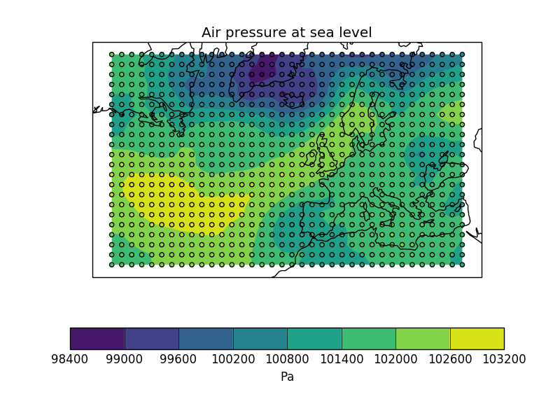
# Plot #1: Point plot showing data values & a colorbar
plt.figure()
points = qplt.points(air_pressure, c=air_pressure.data)
cb = plt.colorbar(points, orientation='horizontal')
cb.set_label(air_pressure.units)
plt.gca().coastlines()
iplt.show()
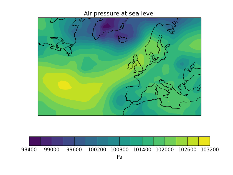
# Plot #2: Contourf of the point based data
plt.figure()
qplt.contourf(air_pressure, 15)
plt.gca().coastlines()
iplt.show()
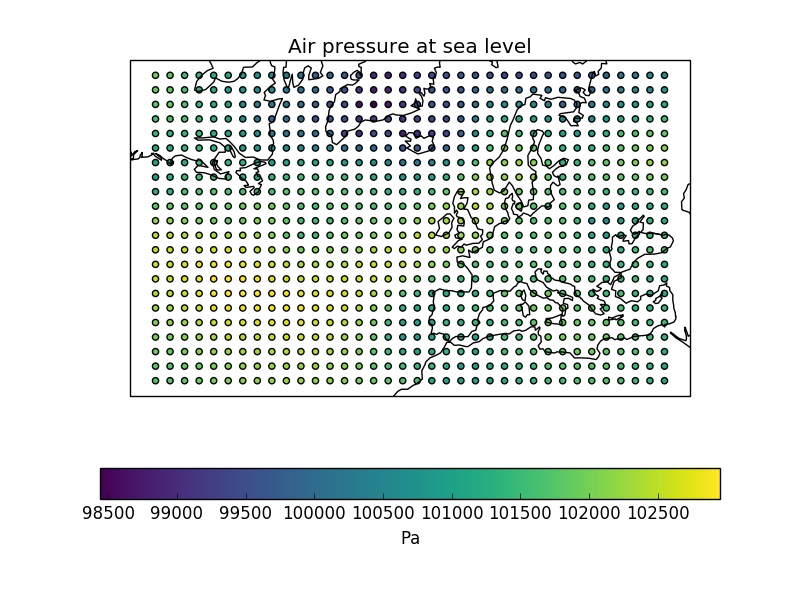
# Plot #3: Contourf overlayed by coloured point data
plt.figure()
qplt.contourf(air_pressure)
iplt.points(air_pressure, c=air_pressure.data)
plt.gca().coastlines()
iplt.show()
# For the purposes of this example, add some bounds to the latitude
# and longitude
air_pressure.coord('grid_latitude').guess_bounds()
air_pressure.coord('grid_longitude').guess_bounds()
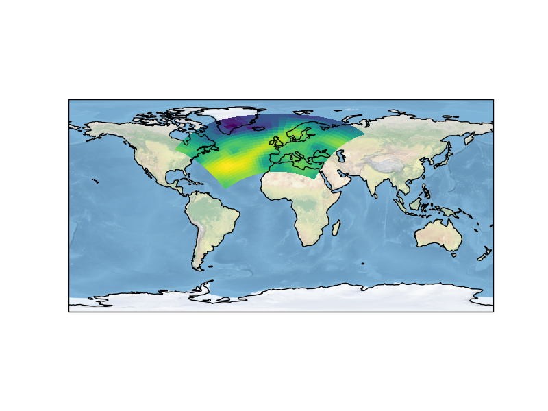
# Plot #4: Block plot
plt.figure()
plt.axes(projection=ccrs.PlateCarree())
iplt.pcolormesh(air_pressure)
plt.gca().stock_img()
plt.gca().coastlines()
iplt.show()
if __name__ == '__main__':
main()

(png)
(png)
(png)
(png)